
Last March, we shared a piece on why we all should care about tech accessibility. We argued that accessibility was crucial because it democratized technology, putting it at everyone’s reach, from people with physical disabilities to individuals without tech-savviness. We said (and I quote) “[accessibility] can give all of us a new sense of comfort, aid us in the future, and lead us to a new way of interacting with the world in incredibly sophisticated ways without leaving anyone out.”
That article came out just before the pandemic fully hit us. After the Coronavirus started to spread throughout the world, the need for accessibility became more evident. As lockdowns forced us to seek technology to work, study, and keep some semblance of normalcy in our daily lives, many people struggled to make sense of that new digital reality. Besides the challenges brought by the disease itself, many people also had to face new digital tools and environments without preparation or previous knowledge.
As the complicated implementation of those technologies across different areas comes to show, a lot of the tech many of us take for granted presented challenges for other people. Of course, those issues were multifaceted and weren’t just caused by the tech’s lack of accessibility. But I’m convinced that if we all followed accessibility principles more closely, those new users wouldn’t have had that many problems.
I’m writing this article – because we need to start tackling the accessibility issue today. Naturally, this isn’t an issue that we’ll solve overnight, as it has many implications. But we have to start at some point, right. That’s why I decided to share some essential accessibility tips for you, focusing on the part of digital tech that users interact with: the user interface.
Some of this might seem basic, but they are the foundation of accessibility in UI design, so it’s always important to remember them. But before diving into these five simple ways to make UI more accessible, let’s revisit what accessibility means when applied to user interfaces.
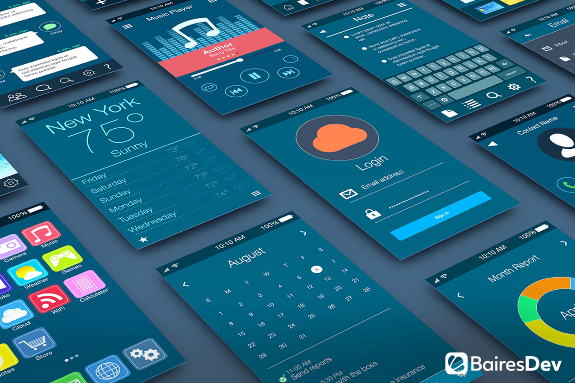
What is UI Accessibility?
In the simplest terms, working on accessibility for any product (digital or not) implies improving its usability to ensure any person can use it comfortably and without major complications. In other words, it focuses on ALL users and it aims to provide the same user experience for all.
That means many things, as making something accessible will have you thinking about how you can make your user interface more understandable, intuitive, and clutter-free. That process will need you to think about users with low vision, blindness, hearing, cognitive or motor impairments, those with situational disabilities, and low or zero tech-savviness.
UI accessibility is a tricky thing that requires you to think out of the box to consider all kinds of users. For that journey to be successful, you should remember the three main principles of UI accessibility:
- Clear: interfaces should have clear layouts with distinct buttons, menus, and calls to action.
- Robust: an accessible product aims to serve the widest variety of users possible, regardless of their particular conditions.
- Specific: the interface should take maximum advantage of the available accessibility features (i.e. in a mobile OS).
With all that in mind, it’s time to see those suggestions to improve your UI’s accessibility.
Leverage Color And Contrast
Color and contrast lie at the center of software design, so it’s the best place to start thinking about UI accessibility. Combining both of them, you can make your interface easily noticeable, even for people with color blindness or visual impairments. In fact, using color and contrast in the right way suggests the proper form in which the users should approach the product, highlighting certain elements and even pointing towards a proposed direction for navigation.
To achieve that effect, you have to use well-contrasting colors and allow plenty of whitespaces to emphasize the resulting contrasts. You can use the most dramatic color contrasts to highlight your most important elements (buttons with your primary CTA or menu items that provide access to support).
Also, remember that contrast isn’t just about color. You can use contrasting shapes, sizes, and even fonts to achieve the same effect.
Pay Attention To Visual Hierarchy
It’s highly likely that, if you put enough emphasis on contrast and color, you’ll end up with a balanced UI with a clear visual hierarchy. That means that elements have an organic relationship between them, where the most important among them stands out at first glance while the secondary elements complete a coherent narrative map.
That narrative map is the key here, as you use the placement of the different elements to drive specific meaning with your UI (that is, you try to convey how you want the users to perceive and use the interface). A couple of things you can do to achieve a better visual hierarchy is avoiding the overcrowding of the different screens. Define the absolute essential elements for each and build around them but always try to be as economical as possible.
Also, remember that even with the best layout you can come up with, there will be people with impaired vision that will need aid to better interact with your product. Make your content scalable and use an easy-to-read font to ensure that they also can use your application, website, or whatever you’re designing.
Use Interactive Elements Wisely
Remember those early internet days when web developers crammed as many interactive elements as possible just because it was fun? Yeah, well, that’s the exact opposite of an accessible UI. Using a lot of interactive features just for flair’s sake can provide your product with a nice look, but it can break your accessibility and make it harder for people to engage.
Naturally, you’re going to need interactive elements to create richer user experiences – but you need to keep their use at bay. So, how can you define whether an interactive element is worth including? Think about how useful it is for the end-user. A small popup pointing to a chatbot can be great for less tech-savvy people to know where to look for help, but blowing it out of proportion can also confuse them.
Thus, interactive elements need to be relevant and timely in that they need to be there to enhance the user experience and provide greater accessibility. Of course, the best way you can find out if you’re doing a good job with interactive elements is to test your product and get specific feedback about them – especially from potential users that might have some accessibility issues in the first place.
Allow Users To Resize Your Screens
I’ve touched a little bit about this in the visual hierarchy section, but this is very important, so I’m explaining it a little further. People might use your product (an app or a website) using screens of different sizes (and even in different orientations). That’s why you should empower your product with adaptability.
Responsive design is the paramount example of adaptability, so you should have it in your sights when developing a product. That doesn’t mean, though, that you should end there. You can provide the users with the possibility of rearranging the UI to fit their needs better. That’s the underlying goal of certain modern users (like Mozilla Firefox), which allows you to rearrange their buttons and commands.
Of course, you’ll also need to make your users aware of their adaptability options. This means two things. First, be sure to introduce those features to the users as soon as they start using your product. And then, don’t bury accessibility options deep into a sub-menu – you’re aiming for an accessible UI, so everything that can make it more accessible for users should be within their reach.
Test, Adjust, And Test Again
Even the most comprehensive list of tips for UI accessibility can’t cover all the accessibility possibilities you can find in any audience. The only way you can be sure that your product is accessible for your users is to test it with real people’s help and adjust it according to their feedback.
Doing that will provide you a better understanding of how people see your UI and how they engage with it. Gathering the data from those tests can help you investigate the different points of view in your audience and better inform your UI design to make it even more accessible.
Tests are an inherent part of the design process, and you should definitely do them. Even if you feel like your UI is foolproof, you should conduct some real-use tests nonetheless. You never know the kind of insight you’ll get once your product reaches your audience, so it’s better to tackle any potential issue through a controlled testing group than having to patch it up after hitting the market.
Time To Start Caring About UI Accessibility
As you surely noticed, these are rather basic tips that can get you started on the topic of UI accessibility. Remember, though, that these are by no means the only things to keep in mind when designing for accessibility. There are other options you should explore, especially those around specific platforms, devices, and (most importantly) target audiences.
And if you’re still in doubt about the importance of accessibility, I recommend you go back to that March blog post and read the reasons why you should care. Hopefully, you’ll end up understanding how it can benefit everyone: you, your company, your target audience, and society as a whole.


