


Your interface looks modern, but under the surface, it’s showing strain. Inconsistent components, awkward scaling, and accessibility gaps are emerging. They aren’t just design bugs, but signs of growing UX debt that slows your users down and adds risk.
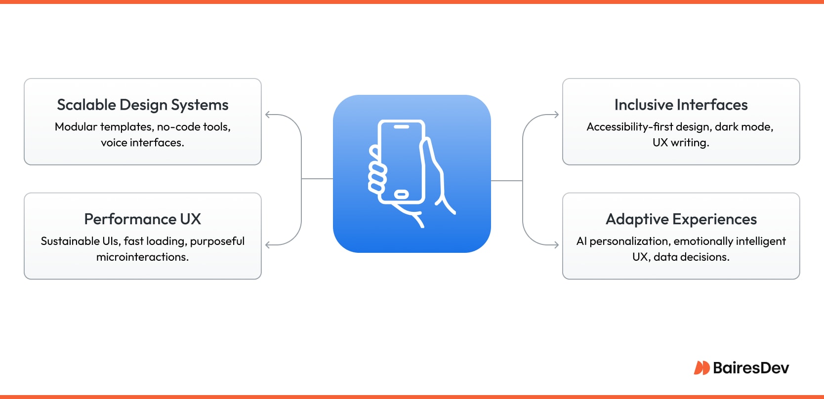
If your org still treats things like voice UI and modular systems as “extras,” you’re most likely building fragile products. The right UX/UI principles can reverse that. One note of warning: Just because a thing is trending doesn’t mean you should climb on the digital bandwagon. Some trends are covered in this article so you can dodge them.
UI/UX Design Trends to Watch in 2025
The latest design trends reflect changing user habits, but the fundamentals still hold. Jakob Nielsen’s usability principles still apply, even as artificial intelligence takes center stage.
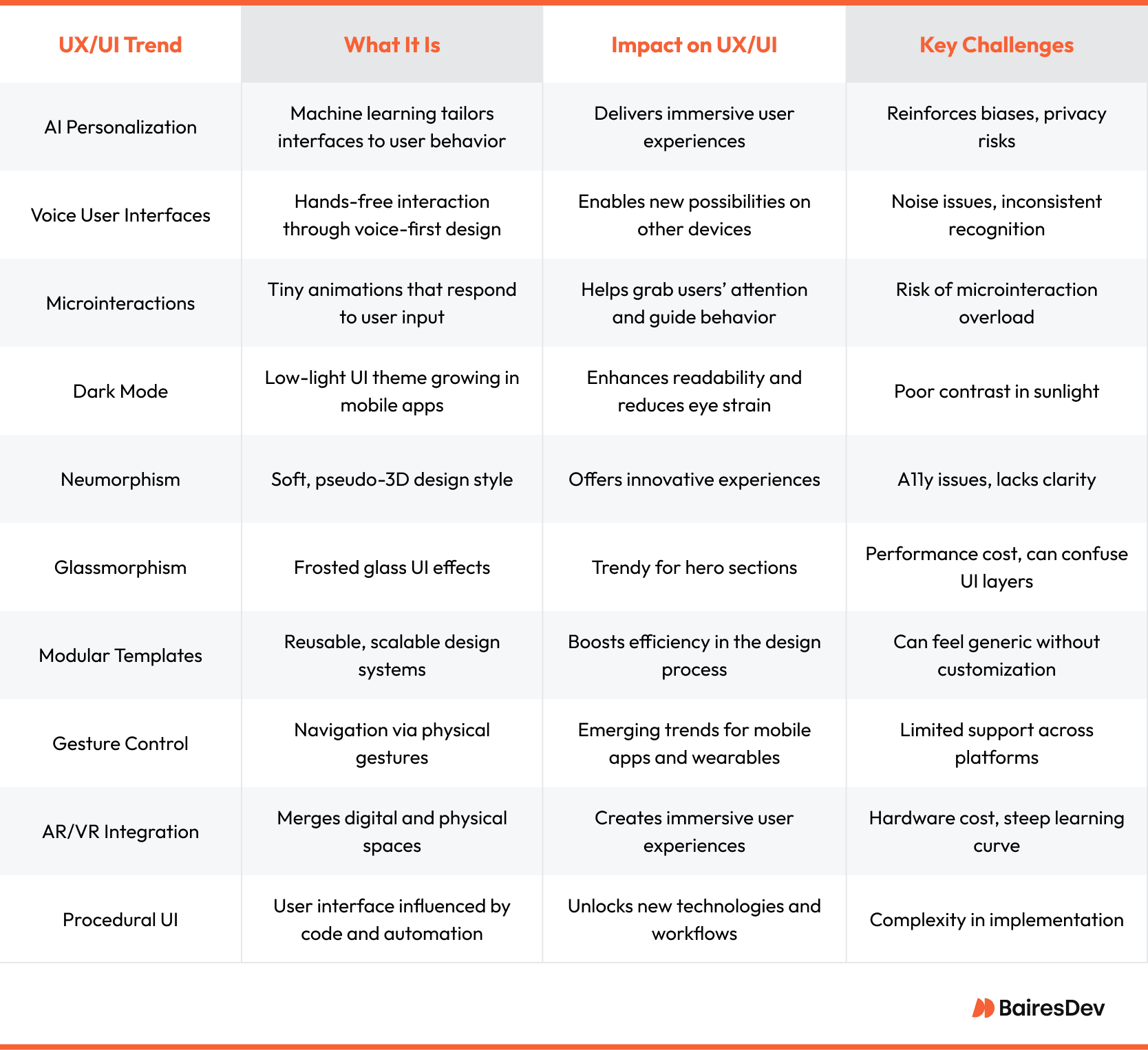
AI Personalization
AI-powered UX feels like magic until it breaks. Predictive interfaces that anticipate needs can build engaging digital experiences, but cross a line, and users recoil. In the design world, privacy matters as much as polish.
When implemented with consent and context, AI improves digital experiences by finding relevant digital content and changing the interface to fit behavior. In Spotify’s desktop experience for instance, real-time suggestions are helpful without the creep factor.
However, too much personalization can get attention for the wrong reasons. Users may feel surveilled if your system over-analyzes their reactions. Bold typography and visual tricks won’t save a design that makes people uncomfortable. Avoid AI that guesses intent too aggressively without transparency.
What to Do
Use AI to support the user journey, but don’t dictate. Give users opt-in choices. Document how data fuels each feature. And test regularly with real users to avoid pitfalls. Tools like TailwindLabs’ Tailwind stack can keep your design grounded while you integrate AI.
Microinteractions
You tap a button, and it pulses. A message is sent, and the icon wiggles. That can feel satisfying if it’s done correctly. When microinteractions guide the user’s eye, they improve user experience. But when every tap is a dance, you risk distraction.
Used thoughtfully, microinteractions enable seamless integration across screen sizes. Take the subtle bounce on Dribbble’s save icon. It reinforces user interactions without disrupting flow. Tiny touches like that humanize the user interface and support real user needs without drawing attention.
Overused animations clutter UI design and slow the user down. When everything moves, nothing stands out. This is where many UI design trends go sideways with more “wow” than why. User research needs to look for microinteraction overload to avoid fatigue.
What to Do
Stick to animations that clarify function or reinforce feedback. Prioritize speed and clarity. Respect visual hierarchy. And if you’re designing for smart assistants or realistic textures, lean on consistency. Don’t fall into the trap of mistaking motion for usability.
Voice Interfaces and Procedural UI
Smooth, intuitive, and hands-free, voice user interface is no longer a gimmick. As technology advances, procedural design via tools like the Shortcuts app bring real utility to modern UX.
Voice commands help users do daily tasks faster, especially in mobile and smart home use. For example, UX designers have boosted completion speed by putting voice-first options in scheduling apps.
Procedural UIs give power users a deeper layer of control. These systems boost user experience by connecting apps and automating steps. But they have to be flexible and easy to understand without a training session.
These UI trends should prioritize accessibility, feedback, and clear information architecture. Designers should use practical user interface patterns that change to fit with user needs.
Accessibility First
Sharon tries to use a job application portal, but her screen reader can’t open it. She closes the tab, unseen and unheard by a product team that never tested for accessibility. Accessibility isn’t a nice add-on. It’s one of the most critical key aspects of modern design.
Inclusive design means building for everyone. That includes people using screen readers, voice controls, or physical assistive devices. The A11y Project has become a go-to resource for implementing WCAG standards that make digital products accessible without sacrificing creativity. This includes using bold typography for readability and contrast, especially in dark mode.
However, trendy styles like flat design and glassy UIs sometimes exclude users who have visual impairments. Micro interactions can backfire if they’re not keyboard navigable or screen-reader friendly. We expect accessibility in the physical world. Why not in our apps?
What to Do
Start with inclusive design patterns. Test using diverse devices. Choose design tools that support semantic HTML and ARIA. Augmented reality is fun, but don’t forget to add captions and tactile cues. A seamless experience should be usable by all, not just the well-sighted.
Dark Mode
Your eyes relax in a dim room. The interface fades into the background. But step into sunlight, and suddenly that same dark mode UI becomes a squint fest.
Dark mode has become the default across platforms over the past few years. It reduces eye strain, saves battery on OLED screens, and adds a sleek edge to UI design. It’s especially effective in entertainment apps where visual immersion matters. UX designers use it to notch up aesthetics while maintaining user focus.
The tradeoff is that dark mode can hurt readability in bright light. Low-contrast text and bad font choices can ruin the user experience.
What to Do
Use proper contrast ratios. Test with real users in multiple lighting conditions and use tools that support adaptive theming. Your goal should be to make UI design functional in different lighting setups.
Neumorphism and Glassmorphism
Neumorphism and glassmorphism look stunning in a Behance mockup, but in a real-world app, they can sabotage your usability.
Both styles cater to modern aesthetics. Neumorphism mimics depth with soft shadows. Glassmorphism creates frosted, translucent layers. They feel futuristic, and integrating digital elements like these makes your work stand out in a portfolio or concept design.
But low contrast, vague affordances, and decorative micro interactions can wreck the user experience, especially for users relying on screen readers or keyboard navigation. Sleek designs sometimes break visual hierarchy and disregard core UX/UI best practices.
What to Do
Limit these styles to cosmetic elements like cards or hero sections. Test readability and contrast in diverse conditions and always back design decisions with real user testing.
Emotionally Intelligent UX
Amazon’s Alexa is learning when to whisper, just like Samantha in Her (2013). That’s where emotionally intelligent UX is headed.
Today’s best UX design is empathetic. Designers are using expressive typography and contextual animations to craft interfaces that build trust and emotional resonance. With wearable devices and augmented reality, the best UI feels like a human friend.
But emotion can’t override function. Overdone animations or forced friendliness can feel manipulative. The key is authenticity. UX designers have to keep things clear to support user goals without distracting from them.
What to Do
Start by mapping emotional states to interactions. A failed payment prompt shouldn’t feel the same as a welcome screen. Subtle animations and tone-aware copy can shift a user experience from cold to comforting. Emotionally intelligent interfaces use machine learning algorithms to adapt content and tone. Consider PX behavior, not just button clicks.
Performance First
Even a one-second delay in load time can drop conversions by 20%. In 2025, fast, light UX wins the race and secures user engagement.
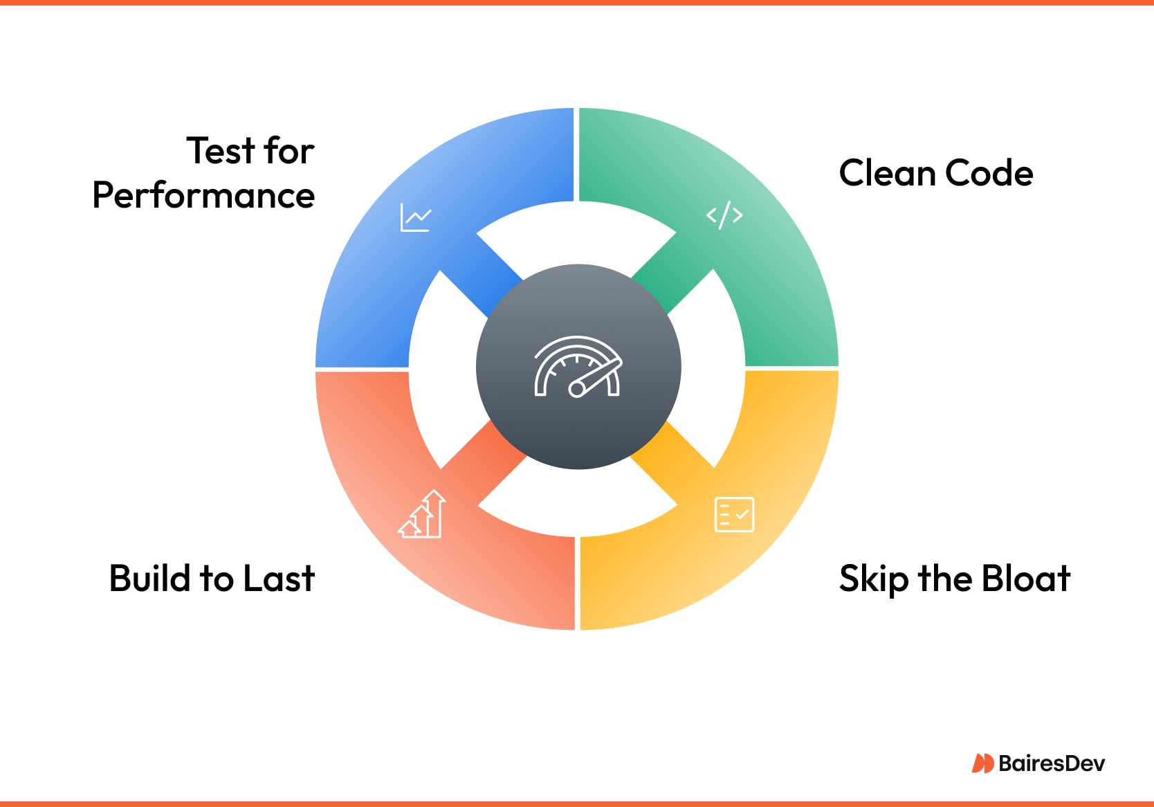
- Prioritize Clean Code: Minimize JavaScript and compress images. Use CSS Grid for layout instead of bloated frameworks. This enhances both sustainability and user experience.
- Skip the Bloat: Ditch unnecessary animations and custom loaders. Lean into minimal design that delivers without draining. Keep pages under 1MB to support users on low bandwidth.
- Build to Last: Avoid UI trends that fade fast. Choose modular design components that adapt over time, especially for virtual reality or augmented reality interfaces.
- Test for Performance: Use tools like Lighthouse to audit speed. Monitor loading times across devices—especially in mobile-heavy markets.
No-Code Tools
No-code platforms are speeding up UX cycles, but they’re not magic. They make web design feel like plug-and-play, yes. The downside is that they can sacrifice depth.
Tools like Webflow and Framer let UX designers rapidly prototype, test, and deploy without writing a single line of code. For landing pages, MVPs, or content-driven layouts, these platforms align well with modern UX trends.
For complex systems, no-code limits logic and performance optimization. Need to support custom PX behaviors? Eventually, no-code will hit a ceiling, and you’ll need to hand your project off to devs.
What to Do
Use no-code early to validate ideas with users. Then, when control matters, go full-code. Even Protopie, known for advanced interactions, can’t replace custom engineering in complex flows.
UX Writing and Content-First Interfaces
The best interfaces are subtle. When UX writing lands right, users feel seen and guided. Good writing is the quiet power move behind high-performing UI design.
When users hit a snag, the last thing they need is a vague “Something went wrong” message. Useful UX writing turns friction into clarity. Actionable, plain language like “We couldn’t connect. Try again in 30 seconds” keeps users informed.
AI-powered tools can speed up drafts, but they can’t replace human judgment. UX writers need to craft content with intent, especially in products that span different languages and accessibility needs.
What to Do
Emotionally intelligent design directs how your product sounds. Whether it’s reassuring copy during onboarding or gentle nudges in settings, consistent tone builds brand loyalty. Think of Apple’s “You’re all set” confirmation. It’s efficient and on brand.
- Pair copy and UI/UX design early.
- Test content with real users, especially in empty states and error flows.
- Define a voice guide for consistency across your interface.
Modular Templates and Bento Box Layouts
Modular templates are the backbone of modern UX systems. When paired with bento box grids using CSS Grid, they create structure, scalability, and clarity.
Bento box layouts support responsive design across screen sizes and devices, making them perfect for dynamic content and adaptive UX. They simplify component reuse, cut dev time, and reinforce consistent visual hierarchy. That’s crucial for growing product ecosystems.
Avoid rigid templates that feel cookie-cutter. Draw inspiration from platforms like Godly, but always tailor web design systems to your brand’s tone, function, and context. Strive to make the interface work harder for the user.
What to Do
Modular templates and bento box layouts work great in dashboards, landing pages, and apps with diverse content types. UX designers can use them to make each element fit neatly in a flexible structure that can evolve over time.
Data-Driven UX
A top-performing hero section should be data-backed. UX design in 2025 starts with understanding what users do and say.
Conversion rates, drop-off points, and scroll depth are just the beginning. Smart UX teams dig into heatmaps, task completion times, and NPS. For web design, session duration and interaction zones offer insights into engagement and usability. These metrics help identify friction and help create experiences that align with real user behavior.
Obsessing over vanity metrics like pageviews or bounce rates in isolation builds false confidence. Numbers need context. They don’t explain why users leave or what they struggle with. Similarly, acting on A/B tests without enough volume or segmenting data poorly can mislead you.
What to Do
Pair analytics tools with AI to detect patterns and predict user intent. For example, if your users abandon an onboarding flow, tweak microcopy or visual hierarchy, not just the color of a CTA. This is where procedural design comes in.
UX isn’t static. Let data guide iteration. As Don Norman’s Emotional Design points out, great products connect logically and emotionally. That starts with knowing what users actually do.
Need help designing a scalable, modern, and accessible interface? BairesDev’s UX experts can elevate your product with insights rooted in Emotional Design.
Why Enterprise UX Still Lags (And How to Catch Up)
You open an internal tool to complete a simple task. Five clicks and three scrolls later, you’re still not done. It feels like using a fax machine, and many enterprise apps are still stuck in the “desktop-first” era. They suffer from clunky UI, sluggish performance, and zero delight. But it doesn’t have to be that way.
Legacy systems resist change. Updating them risks breaking workflows tied to dated UI components and design logic. Teams often avoid redesign due to fear of disrupting daily operations, locking themselves into obsolete patterns and slow user adoption.
How to Move Forward
Begin with modular templates. These scale design updates without rebuilding everything from scratch. Audit interaction flows, then modernize one screen at a time. Look to Susan Kare’s approach of clarity and simplicity first.
Adopt procedural design thinking. Break down tasks into steps, automate redundancies, and test with real users. Even incremental shifts can have a major impact on user satisfaction and performance. Enterprise UX doesn’t have to lag behind. It just needs to stop treating change like a risk and start treating it like a responsibility.
Good Design Is What Endures
Trends shift, but great UX still comes down to solving real problems with clarity and care. That won’t change. The best interfaces make users feel seen.
New trends like glassmorphism may come and go, but empathy, usability, and accessibility are timeless. In Nature of Code, Daniel Shiffman explained that complexity should serve purpose. Design with restraint, and always start with what users need, not what fits best in a hero section.
BairesDev’s UI/UX experts help you break free from desktop-first constraints and trend-chasing fluff. From modular templates to accessible design, we create thoughtful, scalable experiences that last. Ready to build with clarity and confidence? We can help.
Frequently Asked Questions
How do we future-proof our UX without rebuilding everything from scratch?
Start by treating your design system as a living product, not a style guide. Audit the current components, identify where usability debt is creeping in, and convert high-use patterns into modular assets. That lets you swap colors, motion, or layout rules as needs change. Layer in continuous research loops, so small fixes are handled on time. Finally, keep your front-end architecture loosely coupled.
Which trends actually improve usability in enterprise platforms, and which ones add noise?
Anything that tightens feedback loops or removes steps usually helps. Purposeful micro-interactions, well-tested dark mode, and data-driven personalization all raise task success rates when they’re grounded in research. On the flip side, decorative-only styles tend to bloat payloads and muddle hierarchy. A good gut check: if it doesn’t shorten time-to-completion or boost accessibility, it’s probably ornamental.
What’s the fastest way to modernize legacy interfaces without disrupting daily operations?
Wrap the legacy stack with a component library that mimics existing UI widgets one-for-one, then swap old parts for new during natural release cycles. Start with the highest-traffic screen, so users feel an immediate win and stakeholders see measurable impact. Behind the scenes, introduce a feature flag system. If anything misbehaves, ops can toggle back to the old experience in seconds.
How do we ensure AI-driven interfaces support and not override user intent?
Give users transparent control, such as clear opt-ins, an easy way to adjust recommendations, and a visible “why am I seeing this?” affordance. Train models on task-oriented signals rather than purely engagement metrics. Embed human validation checkpoints and the ability for support teams to override decisions.


