

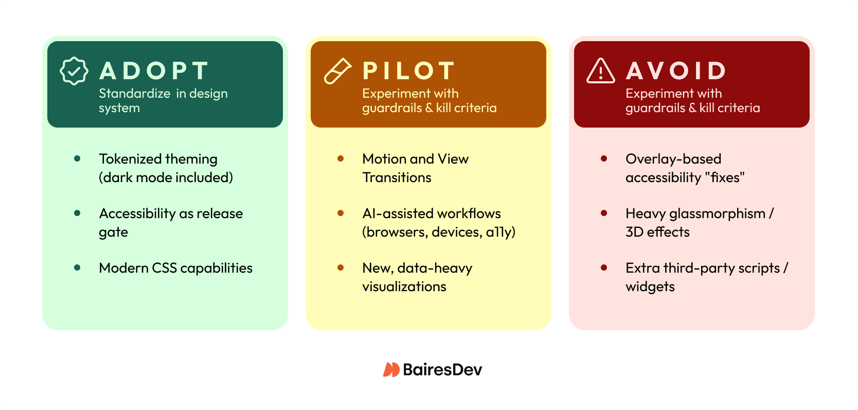
Chasing web design trends without a decision framework will leave you with a portfolio of unowned UX liabilities. At enterprise scale, you need an adoption rubric that protects performance budgets and design system coherence while still letting teams move forward.
- Adopt: Tokenized theming with dark mode, accessibility as a release gate, modern CSS that replaces custom JS, and interaction SLOs (INP p75, segmented by mobile)
- Pilot: Motion and View Transitions, AI-assisted workflows, new data visualization patterns, all feature-flagged with kill criteria
- Avoid: Accessibility overlays, heavy glassmorphism on core flows, decorative elements, and third-party scripts without explicit owners and rollback plans
Trends as Delivery Decisions
Most top web design trends articles assume your biggest risk is looking dated. In a mid-market enterprise org, your bigger risk is shipping a trendy pattern that degrades Core Web Vitals or becomes a one-off snowflake your design system can’t absorb.
In 2026, the web is getting heavier at the same time teams want richer visuals and more “app-like” interactions. Median mobile pages are already in the multi‑MB range, and nearly every page drags in at least one third-party resource. That’s why trend adoption has to look less like a mood board and more like an engineering decision. Define the outcome you want (task completion, conversion, fewer support tickets). Then, protect your experience budgets (INP and LCP at p75), and control blast radius with feature flags and clear rollback triggers.
This is a decision-focused review of the current trends that are actually changing delivery in 2026. It’s also an “adopt / pilot / avoid” shortlist you can use to align squads without turning design into a quarterly incident source.
Redefining “trend” for 2026 delivery
A web design trend stops being useful the moment it’s just an aesthetic mood board. In 2026, treat a trend as the overlap of three things:
- Platform capabilities (what browsers and CSS can reliably do)
- UX patterns (how people complete tasks in the digital space)
- Operational constraints (performance budgets, accessibility, governance, and the reality of multiple squads shipping weekly).
A frosted-glass effect might improve visual appeal, but if it pushes LCP over budget on mid-tier Android, it’s not a trend. It’s unplanned work with a long tail. Small visual changes aren’t always low risk. At enterprise scale, the risk often comes from regressions you don’t measure.
When you evaluate any candidate trend, test it with Impact, Cost, Risk. Impact is user behavior change (task completion, conversion, support volume, INP and LCP at p75). Cost means build and maintenance. Risk means accessibility, third-party volatility, and rollbackability. If you can’t ship it behind a feature flag with clear SLOs, you’re not ready to “adopt” it.
The adoption rubric: Impact, Cost, Risk
If you want a trend review that survives contact with a quarterly roadmap, you need a repeatable rubric your squads can apply without a committee meeting. Avoid defaulting to “We’ll know if users like it.” At your scale, you usually discover regressions through incident channels, support volume, or a slow slide in conversion, and by then you’ve already baked the pattern into multiple surfaces.
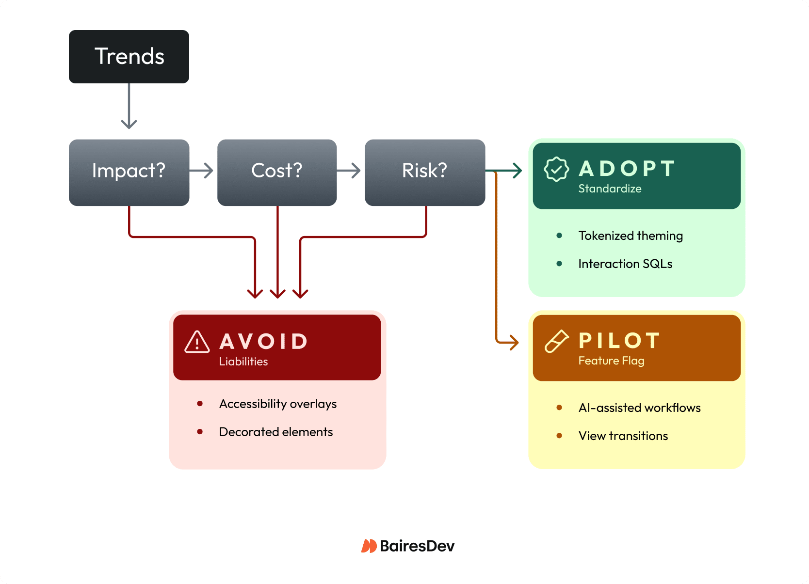
Use Impact, Cost, Risk as a lightweight gate for every proposal, from “add View Transitions” to “ship a denser data viz style.” Treat it like an RFC: define what “better” means, how you’ll measure it at p75, and what would make you roll it back. If you can’t state a kill criterion, you’re not adopting a trend, you’re starting a permanent experiment.
| Dimension | What to Measure | Examples |
| Impact | User outcomes, experience metrics, operability signals | Task completion, INP at p75 (≤ 200ms), support tickets tagged to UX confusion |
| Cost | Design system fit, testing surface, ongoing work | Can you express it with tokens? Does it force one-off CSS forks? New “design debt” classes? |
| Risk | Rollout control, accessibility/legal exposure, performance volatility | Feature flag availability, WCAG-grade semantics, third-party script impact |
Impact (measurable outcomes)
- User outcomes: task completion, time-to-first-success, form completion, error rate.
- Experience metrics: INP at p75 (aim for ≤ 200ms), LCP and CLS (especially on mid-tier mobile).
- Operability signals: support tickets tagged to UX confusion, rage clicks, back button usage.
Cost (delivery and maintenance)
- Design system fit: can you express it with tokens and existing components, or does it force one-off CSS forks?
- Testing surface: visual regression coverage, accessibility testing, browser and device matrix, content authoring rules.
- Ongoing work: does this add new “design debt” classes (new motion rules, new variable fonts, new chart primitives)?
Risk (and governance)
- Rollout control: feature flag, gradual exposure, per-route enablement, instant rollback.
- Accessibility and legal exposure: overlays don’t reduce risk by default; “trend-first” UI still needs WCAG-grade semantics.
- Performance volatility: third-party scripts and heavy assets make “minor” UI trends unpredictable.
How to operationalize this in your org
- Add the Impact / Cost / Risk checklist to your design change RFC template.
- Require a one-page pilot brief for any new pattern that touches core flows (auth, billing, admin).
- Standardize the Adopt / Pilot / Avoid categories in your design system documentation so the web design team knows what’s allowed by default.
Responsiveness-First UX in the INP Era
In 2026, “responsive” can’t just mean breakpoints. You need responsiveness as an interaction constraint: every tap, drag, type, and open should feel immediate even when you’re layering in richer UI. It can be tempting to think “it’s just a little animation” won’t matter. On web pages with third-party scripts and complex state, that “little” work turns into long tasks that blow up INP.
Operationalize it like an SLO: stay inside your INP SLO, and segment mobile vs. desktop so you don’t hide regressions in averages. Then make interaction design choices that protect the main thread: keep state updates small, avoid synchronous layout thrash, and defer non-essential work until after the user’s input completes.
For example, if you’re adding an app-like filter drawer to a B2B analytics screen, treat “open drawer” as a budgeted interaction. Ship behind a flag, record p75 INP plus rage-click rate, and set a kill criterion when a new component or vendor tag starts stealing time from input handling.
Accessibility-Forward as a Release Constraint
If you treat WCAG 2.2 as a “later” checklist, you’ll ship accessibility defects at the exact moment they’re hardest to unwind: after multiple squads have copied the pattern. An accessibility overlay won’t necessarily reduce exposure. In 2025 reporting, a material share of ADA site lawsuits targeted sites using overlays, which means “we installed a widget” won’t protect you when users still can’t complete tasks.
Make accessibility a release constraint the same way you treat uptime or security: you define it, you gate on it, and you assign an owner. WCAG 2.2 pushes you toward interaction-level quality (keyboard focus visibility, target size, avoiding drag-only interactions). That’s product quality, not brand polish, and it directly impacts support volume and renewals when enterprise users can’t navigate forms or admin surfaces.
For example, if your design system ships a new date picker, require keyboard-only completion, deterministic focus order, and automated checks in CI before anyone can consume it. You’ll trade a bit of delivery speed up front for a smaller risk footprint and fewer “roll it back” incidents later.
Motion and Transitions With Guardrails
Motion is the fastest way to make a UI feel “premium,” and the fastest way to ship jank you can’t unsee. The assumption to drop is that animation is harmless garnish. Parallax, kinetic type, and app-like transitions all compete for main-thread time. They often fail in ways your QA won’t catch until mid-tier mobile and real third-party tags enter the chat.
Treat motion like any other production capability: governed, measurable, and easy to shut off. Let’s say you introduce route transitions to make a multi-step onboarding flow feel cohesive. Commit to shipping it as progressive enhancement and watch p75 INP and LCP for regressions as you ramp exposure.
Your minimum guardrails look like this:
- Honor prefers-reduced-motion by default.
- Set a performance budget for motion-heavy surfaces, and keep interaction work inside your INP target.
- Roll out behind a feature flag with per-route enablement and a clear kill switch.
- Prefer native, standards-based transitions (like View Transitions where supported) over JS-driven scroll and layout effects.
Modern CSS that changes the calculus
If you still treat “modern CSS” as web development polish, you’ll pay a JavaScript tax for problems the platform now solves more predictably. The big shift for 2026 delivery is that several CSS capabilities are mature enough to standardize in your design system. That reduces custom JS. It also cuts regression risk and shrinks the surface area you have to test.
Start by leaning on container queries for component-level responsiveness instead of viewport breakpoints and ResizeObserver glue code. Then use cascade layers to make your system’s “what wins” rules explicit, so a squad can’t accidentally fix a bug by cranking specificity until it breaks another route. Add selective use of :has() to replace brittle “JS adds a class to the parent” patterns, especially for form states and layout tweaks.
For example, let’s say your platform team owns a shared sidebar, tables, and filter panels across five product areas. Container queries let each component adapt to its actual slot (structured layout vs. marketing shell) without branching component variants. You can standardize the allowed query breakpoints and layering conventions and watch one thing immediately improve: fewer one-off overrides that only “work on my machine” in a single viewport.
Theme Adaptability Via Tokens (Dark Mode Included)
If you think “dark mode” is a CSS toggle, you’ll keep paying the same integration fee every time brand or product teams ask for a new theme.
Tokenization turns appearance into an API. Components consume semantic values (surface, text, border, focus ring) instead of hard-coded colors. Deciding you can always retrofit tokens later without churn can come back to bite you. In a multi-squad org, the fastest path to theme work is to stop letting teams ship raw hex values at all.
What it unlocks is compounding leverage: one token change can propagate across marketing, auth, and core app surfaces without bespoke overrides. What it breaks is everything that depended on the current color palette, like chart colors, custom illustrations, screenshots in docs, and third-party widgets that don’t inherit CSS variables cleanly. As an example, a tokenized dark theme can instantly surface contrast failures in legacy table components that used opacity tricks for borders.
A practical decision test: can you name an owner for token governance while you measure contrast regressions at volume?
AI in design and UI: where it pays
AI pays in two very different places, and you should stop treating them as one bet. As a workflow multiplier, it can compress cycle time for web designers. Use it to generate first-pass component variants, draft microcopy options, propose accessibility-friendly alt text patterns, or synthesize QA test ideas for a new onboarding flow. AI output isn’t always disposable. If it lands in repos, design tokens, or content CMS fields, you just created a new source of inconsistent quality and future cleanup.
AI in the shipped product UI is a different reliability class. The moment you let it answer user questions or suggest admin actions, you own:
- The data it can see
- What it logs
- How you detect bad answers
- What the UI does when the model times out.
For instance, an “assist me write a policy” feature in an enterprise console needs deterministic fallbacks and human-review affordances, not just a clever prompt.
Before you greenlight either, force a decision: are you optimizing throughput (cycle time per release), or user outcomes (task completion, support deflection)? Then require an explicit data policy, an evaluation gate for quality, and a feature-flagged kill switch so you don’t page yourselves for a “helpful” UI that went sideways.
Data Visualization as Mainstream UI
The moment charts stop being “reporting” and start driving decisions in-product, you’ve turned visualization into a digital interface. Question the idea that charts are safe because they’re “read-only.” If a KPI trend line renders wrong, hides a segment for color-blind users, or tanks interaction performance, you don’t just ship an ugly screen, you ship incorrect decisions at scale.
Set standards up front so every squad doesn’t reinvent a slightly broken chart:
- Accessibility: keyboard-reachable focus points, non-color encodings, and a readable alternative (data table or summary) for assistive tech.
- Correctness: versioned metric definitions, rounding rules, and a golden test dataset that catches off-by-one and timezone mistakes.
- Performance: budgeted JS cost and interaction latency; charts should not become your worst INP surface.
- Maintainability: shared chart primitives (axes, tooltips, legends) in the design system, not one-off libraries per team.
For example, if you add an “SLO burn-down” chart to an admin console, require a metrics contract and a fallback rendering mode before you roll it across routes.
Ship-ready modern website design (quick check)
- INP ≤ 200ms at p75, segmented by mobile/desktop
- LCP and CLS within budget on mid-tier devices
- Feature-flagged rollout with clear kill criteria
- prefers-reduced-motion honored by default
- Keyboard navigation and visible focus states verified
- Tokenized colors and spacing (no raw hex in new code)
- Components fit the design system (no one-off CSS forks)
- Third-party scripts reviewed, owned, and measurable
Expert Perspective
I’ve watched teams ship trends that looked great in prototypes but became operational liabilities in production. The most expensive mistake? Shipping without clear ownership or rollback criteria. Six months later, the pattern’s spread, tickets are climbing, and at this point no one remembers why it was adopted in the first place.
You don’t need to predict which web design trends will matter with absolute certainty. You need to treat adoption like an engineering decision: define success, measure, know what would make you pull it back. Can’t name the owner for ongoing maintenance? Can’t fit it into your design system cleanly? Pilot it or skip it.
The teams that move fastest have learned to filter ruthlessly. They’ll standardize a pattern when it genuinely reduces squad variance, but they won’t force-fit something trendy into their system just because competitors are doing it. Over time, that discipline builds up, so you don’t accumulate years of design debt that slows down every subsequent release.


